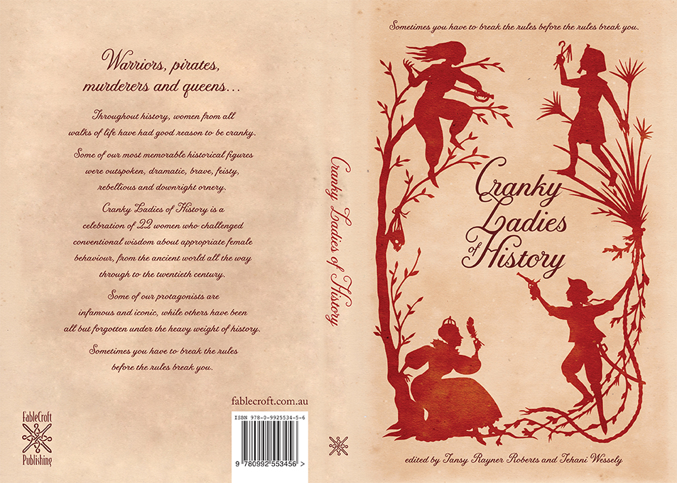
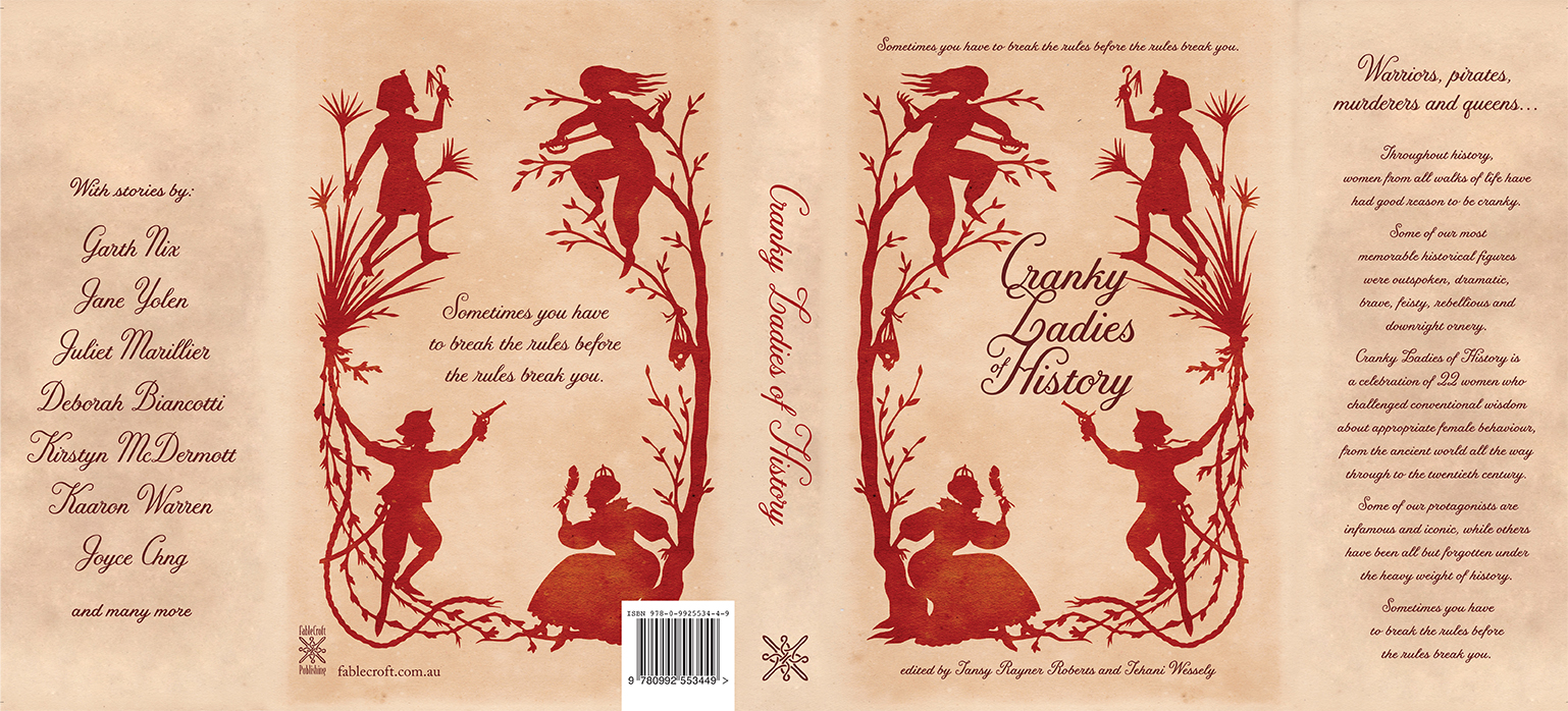
I’m fortunate to have the wonderful, award-winning Amanda Rainey designing book covers for FableCroft. The cover for Worlds Next Door is fabulous and has received some great feedback already. We think a lot about covers and there’s been lots of cover discussions in the blog-o-sphere in recent times too. From the very cool YouTube clip of the creation of a Gail Carriger cover to the issues with representative covers, people clearly care a lot about covers.
It’s one of the oldest sayings around: “Don’t judge a book by its cover!” – a great adage to remember when dealing with people, but to be honest, I’ve never understood it in relation to books! As a teacher librarian, I can tell you that the cover of a book is possibly the most important thing required to “sell” a book to a reluctant reader. Or even a great one. We are visual creatures – if it doesn’t look good, we are less likely to pick it up. The artwork and design of a book cover are its primary selling point, in a library and a bookshop – if the design doesn’t appeal, it is harder to sell, especially an unknown or newish author.
 And it’s not just about being eye-catching. There has been quite a lot of discussion about the diversity of book covers. Controversy recently raged over Justine Larbalestier’s book Liar (released in Australia with an attention-getting and completely inoffensive cover, pictured). This book was originally slated for a North American release with a light-skinned cover model, despite it being clear in the book that the protagonist is African-American. Larbalestier used the power of the Internet to let her publisher know this was an unacceptable whitewashing of her cover, and, with the support of her fans and outraged supporters, managed to get the cover changed. This storm was followed by a second (from the same publisher) over Magic Under Glass by Jaclyn Dolamore, which also resulted in the cover being changed. Looking at book covers over time shows us that the portrayal of women and other-than-white cultures has not been a shining light of publishing history, but it has now become an issue that readers are beginning to have a real say about, and be heard by publishers.

It’s true though that many readers do not notice these politically correct or otherwise portrayals on covers – they simply notice what appeals to them. Orbit Books released a clip showing how a book design comes together which has had over 90,000 hits on YouTube, demonstrating that book covers are fascinating to many of us. Publishers are also quick to pick up on popular covers and duplicate them for other books. See, for example, the new HarperCollins versions of Wuthering Heights, which imitate Twilight. UK author Brett Weeks also talks about this in relation to his own books, saying, “… you want people who enjoyed the Night Angel books but can’t even remember my name to be able to identify that these new books are Brent Weeks books. At the same time, you want to let people know that this is a new series, that the feel of these books is new and different, and basically … appeal to the greatest audience possible. This is made harder if every Tom, Dick, and Harry now has a cover with a hooded man with a sword. (Orbit appears to have started a small trend with my last covers.)”. This was  illustrated to me when I saw the covers of Aussie author Rowena Cory Daniells’ new trilogy “King Rolen’s Kin” (due out as monthly releases this year) – there are obvious similarities to the covers of Weeks’ first trilogy, and I love them! Peter V Brett’s covers are also reminiscent of the Weeks ones, so it’s a definite trend!
 For my mind, book covers should reflect the contents, theme or ideas of the book they are representing, in a way that is evocative, beautiful, striking or arresting in some way – books battle for attention in bookstores and on library shelves and any advantage is a bonus. 2009 Aurealis Award winner for Best Young Adult novel Leviathan by Scott Westerfeld is a perfect example. It practically cries out to be picked up, caressed, and then devoured. The artwork is symbolises the story, depicting it in a gorgeous and captivating way that appeals both to its target readers and adults (who are frequently the book buyers for that young adult audience), and it’s simply one of the most appealing books of the year.
Other 2009 Australian releases that hit my buttons for great covers included Mirror Space by Marianne de Pierres , Scarecrow by Sean Williams and Full Circle, Pamela Freeman . What’s most interesting about these covers is that not only are they beautiful in their own right, but they also manage to act as a cohesive whole with the other books of the series they are part of. While each is unique, each also holds design elements in common with its sister books, which makes it even more appealing to the avid reader.


 And the 2010 book I was MOST looking forward to is Power and Majesty (Book 1 of the Creature Court trilogy) by Tansy Rayner Roberts (released in June from HarperVoyager). Tansy has long been a favourite author of mine with her short stories and her Mocklore books; Power and Majesty is not only already receiving rave reviews – promising to be one of the hottest fantasy novels of the year – but it has the most gorgeous cover, ensuring it will fly off bookstore shelves.
Not all publishers get it right. Some covers make a great book look drab and boring, others completely misrepresent the story being told (I’m thinking particularly of books like Carrie Ryan’s The Forest of Hands and Teeth, a YA zombie novel that is nothing like Twilight, despite what the cover tries to insinuate!). But others get it very very right, and these are the covers that draw us in and carry us away. You really can’t judge a book by its cover, but the cover sure helps!